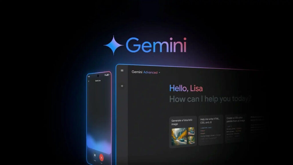
Google has begun rolling out a revamped Gemini overlay design on Android devices, replacing the prior rounded-rectangle slide-up interface with a novel, bouncy animation: the overlay now starts as a small circle in the center of the screen and dramatically expands into a wide pill-shaped interface, offering a more playful and intuitive experience. This smoother, more unified look aligns visually with Android’s Circle to Search interface and the Pixel Launcher search field, while keeping the underlying “plus” menu, voice mic access, Gemini Live shortcut, and drag handle untouched. The new design is currently reaching both beta (v16.33) and stable (v16.32) versions of the Google app.
Sources: 9to5Google, AInvest, NewsByTesApp
Key Takeaways
– The Gemini overlay now features an animation that starts as a central circle and expands into a pill shape, replacing the previous rounded-rectangle slide-in design.
– This visual refresh aligns the interface more closely with other elements of Android’s design system, such as Circle to Search and the Pixel Launcher search bar.
– The update is rolling out across both beta (v16.33) and stable (v16.32) versions of the Google app, making it widely available for compatible Android users.
In-Depth
Google’s latest UI tweak brings a fresh feel to how we interact with its Gemini assistant. Picture this: instead of the overlay sliding up in a rectangular shape, you’re greeted with a circle popping up right at the center, stretching out into a rounded pill. It’s like the interface took a page from your childhood and made the animation a bit more fun and organic. The layout inside hasn’t changed—your “plus” menu, voice mic, Gemini Live shortcut, and drag handle are all exactly where you expect them—but the refined shape and gooey motion give the whole experience a more polished, unified vibe.
If you’ve ever used Circle to Search or glanced at that neat search bar in the Pixel Launcher, this makes sense—it visually syncs with those familiar UI elements. And in a subtle play to keep things consistent across the system, it brings Gemini’s look closer to the rest of Android. It’s a change you’ll notice before you realize what’s different—which is probably the point. No bells and whistles here, just a cleaner, more modern interaction.
The rollout is moving fast: users on beta (v16.33) and stable (v16.32) versions of the Google app are seeing it now. So if your device hasn’t shown it yet, hang tight—it shouldn’t be long before your Gemini overlay is stretching into that new pill-shape. All in all, it’s a smart evolution—minor, but neat, and worth a second look.


