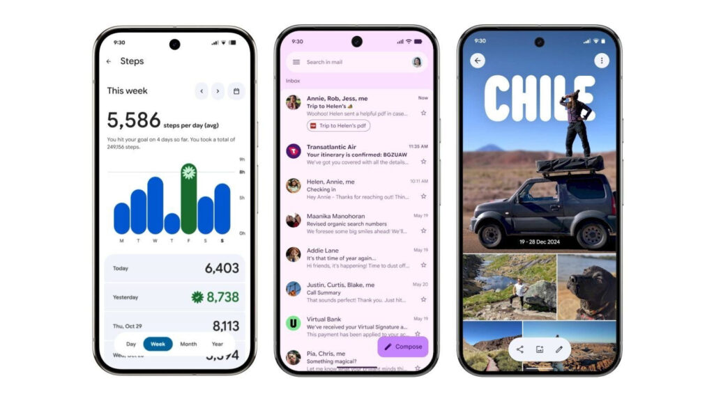
Google is progressively rolling out its Material 3 Expressive redesign to Gmail on Android, bringing a fresh and lively feel to the app’s interface. Each email now appears in its own card-style container with rounded corners, subtly creating a cleaner, more organized look with small gaps between each message for better visual separation. The update also revamps swipe actions—like delete or archive—into smooth, pill-shaped animations, and introduces bolder, filled-in buttons for actions like Reply and Forward within emails . These enhancements are part of a broader push of Material 3 Expressive UI across Android, with Gmail among the first of Google’s apps to showcase the revamped design, alongside others like Google Drive, Messages, and Chrome .
Sources: 9to5Google, WebPro News
Key Takeaways
– Card‑based organization: Emails are now individually encapsulated in containers, providing distinct separation and a tidier inbox layout.
– Enhanced interaction: Swipe actions are upgraded with playful, pill-shaped animations; buttons like Reply and Forward are now more prominent with solid fills.
– Part of wider design rollout: Gmail’s update is part of a broader shift to Material 3 Expressive across Google apps, signaling a unified, modern aesthetic across the Android ecosystem.
In-Depth
Google’s Gmail app is undergoing a subtle yet impactful makeover on Android, as part of its broader adoption of Material 3 Expressive design. Starting with a gentle rollout that began back in June, the freshest update is now placing each email in its own rounded container, separated by narrow gaps—adding a sense of depth and clarity to the inbox that’s both modern and visually pleasing.
Swipe actions that once felt static now animate more playfully—those motions to delete or archive messages are accompanied by pill-shaped animations that bring life to every gesture. Inside emails, the user interface adopts bolder styling with solid, filled buttons for actions like Reply and Forward—making them tangible and easily identifiable.
What’s fascinating is that Gmail isn’t alone in undergoing this transformation. Google is steadily extending Material 3 Expressive across a suite of its core apps—from Drive to Messages and even Chrome—to foster consistency and heightened visual appeal across the device experience. In Drive, for instance, files and toolbars adopt the same containerized look and feel, while Chrome introduces rounded corners and colorful containerization around icons and tab groups.
This design evolution isn’t just cosmetic—it reflects Google’s intent to make digital interactions feel more responsive, organic, and user-friendly. As more apps transition to Material 3 Expressive, users can expect a more unified, dynamic Android experience that aligns aesthetic appeal with intuitive functionality.


