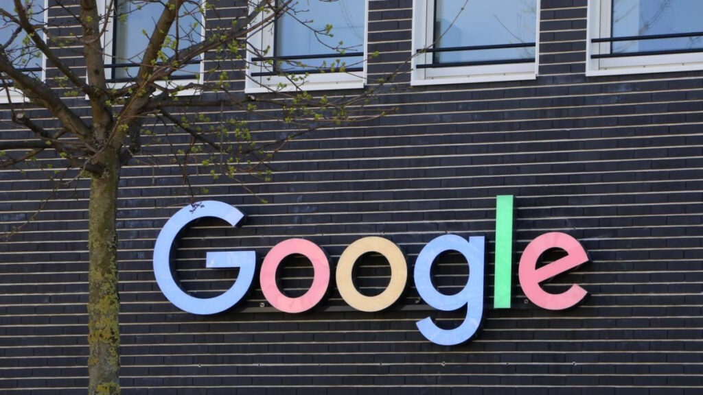
Google is replacing its long-standing block-colored “G” logo with a unified gradient “G” design across its entire brand, signaling a visual shift aligned with its AI ambitions. According to Google’s own blog, the new “Google G” will now represent both the brand and the company, employing brighter hues to symbolize “AI-driven innovation and creative energy.” The gradient style first surfaced in Google Search earlier this year, and will progressively roll out across more products, platforms, and services.
Sources: Google Blog, Droid Life
Key Takeaways
– Google is retiring its segmented, flat-color “G” logo in favor of a single, flowing gradient version that better aligns its identity with its AI products and future strategy.
– The gradient “G” first appeared on Google Search earlier this year and will gradually replace the older logo across Google’s full ecosystem (apps, web, product icons).
– The rebranding is more than cosmetic: it underscores a deeper push by Google to frame itself as an AI-powered company, using visual signals to reflect that strategic pivot.
In-Depth
Google’s decision to roll out a gradient “G” as its official symbol marks one of the most notable branding changes for the company in a decade. Previously, Google’s “G” was rendered in four discrete color blocks—red, yellow, green, blue—a visual identity that became iconic. But in a recent blog post, Google revealed it’s elevating a more modern, blended version of the “G” to represent the whole company, not just a product line. The move is explicitly tied to Google’s broader narrative around AI: as the company positions itself ever more as an “AI-first” organization, the new logo is intended to visually communicate energy, creativity, and evolution.
That gradient version first appeared earlier this year in Google Search, and also in the Gemini spark branding launched in June. Now, the company is unifying its visual language so that the same gradient aesthetic becomes standard across its apps, services, and platforms. In essence, Google is messaging that AI isn’t just a feature but is woven into the very fabric of its identity going forward.
From a design perspective, this shift also helps consolidate visual consistency. As devices, display formats, and user contexts diversify, having a single, flexible “G” mark with smooth transitions rather than rigid color boundaries can be more scalable and legible across sizes. It also reflects a trend in tech branding toward more dynamic, fluid visuals rather than static, segmented motifs.
Of course, branding changes carry risks: users may resist or ignore them, or debate whether a new logo actually brings substance. But Google is leaning into the symbolic power of its mark. By aligning its logo more closely with its flagship AI efforts, the company is signaling that its next chapter isn’t incremental—it’s foundational. The gradient “G” is more than just a visual update; it’s a deliberate repositioning, an invitation to see Google not merely as a search or services company, but as an AI-driven platform in continuous transformation.


